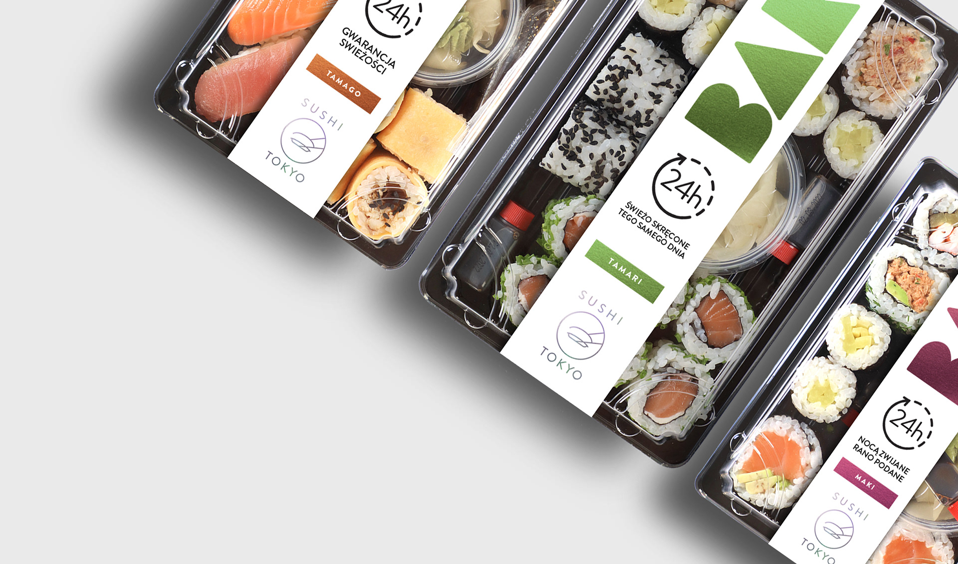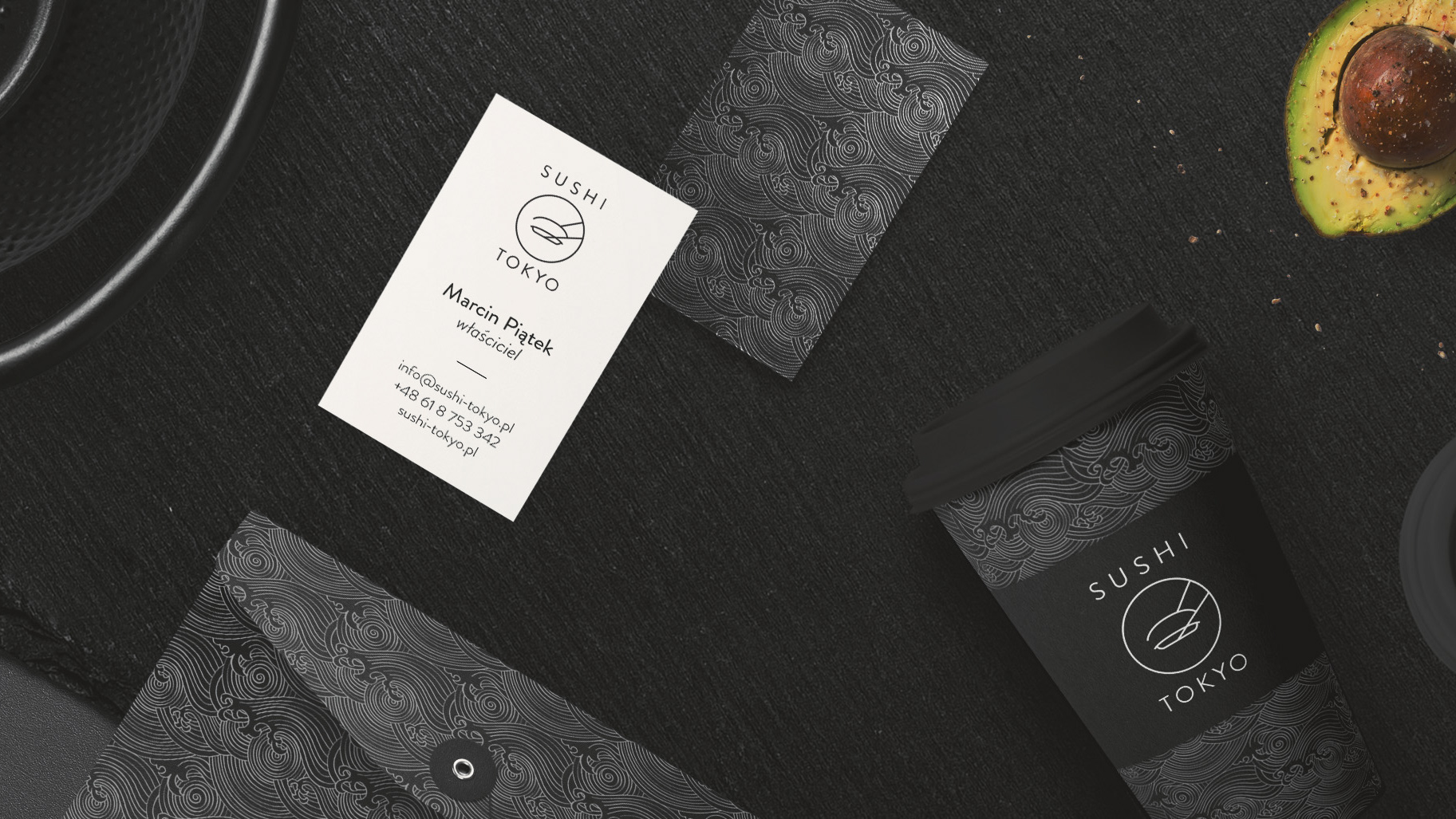
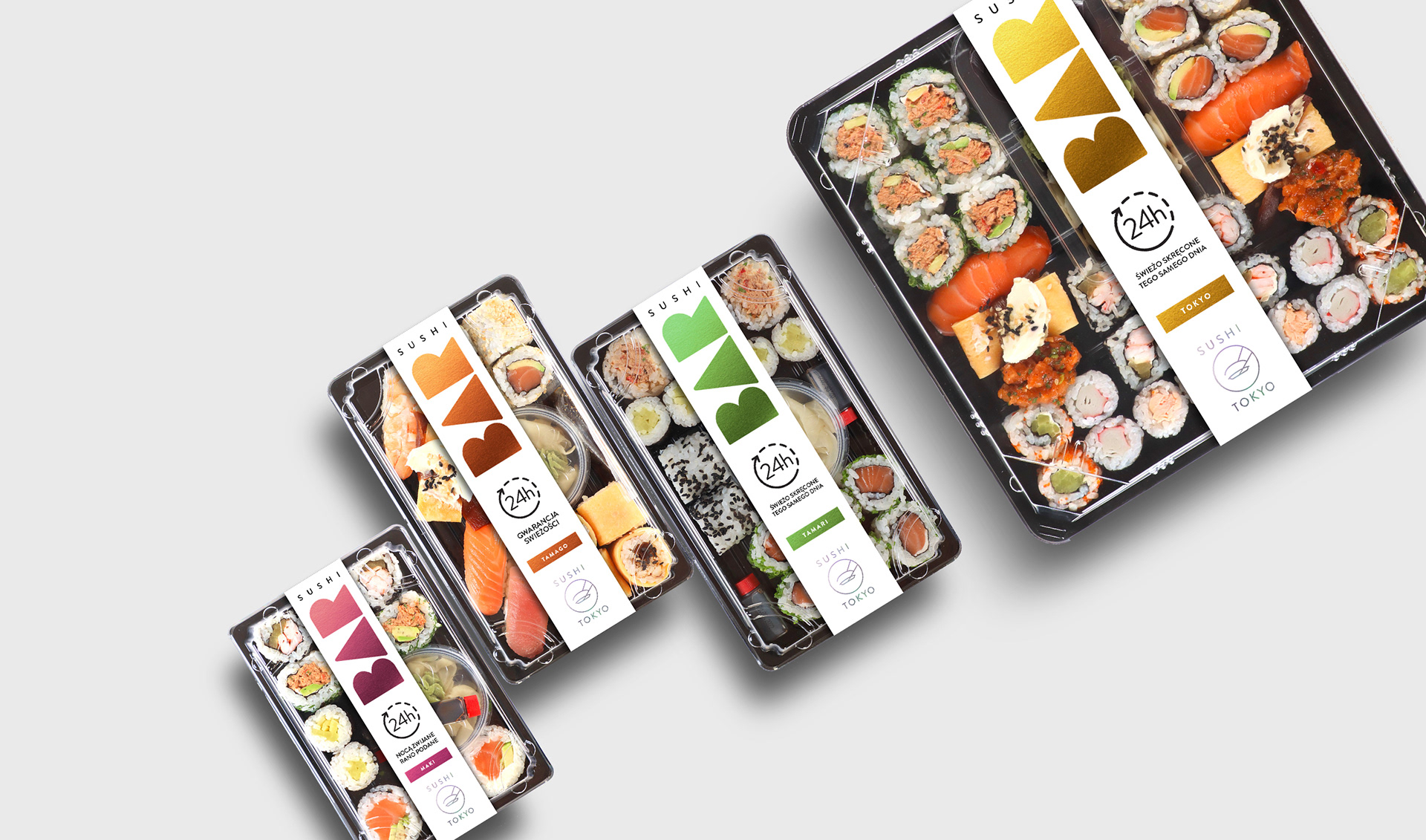
Brand / Sushi Tokyo
My client tasked me with designing a sub-brand and packaging line for their new sushi boxes. What sets these products apart is their exceptional freshness, as they are prepared the same day they are sold. The name 'SUSHI BAR' perfectly captures this quality, clearly conveying that the sushi is as fresh as if it were made in an actual sushi bar.

The most important message for the client was the freshness. To convey this, I used a prominent 24-hour icon with clear, direct information placed centrally on the label. Each box is given a unique name and color to make it easier for customers to identify and choose their preferred option.
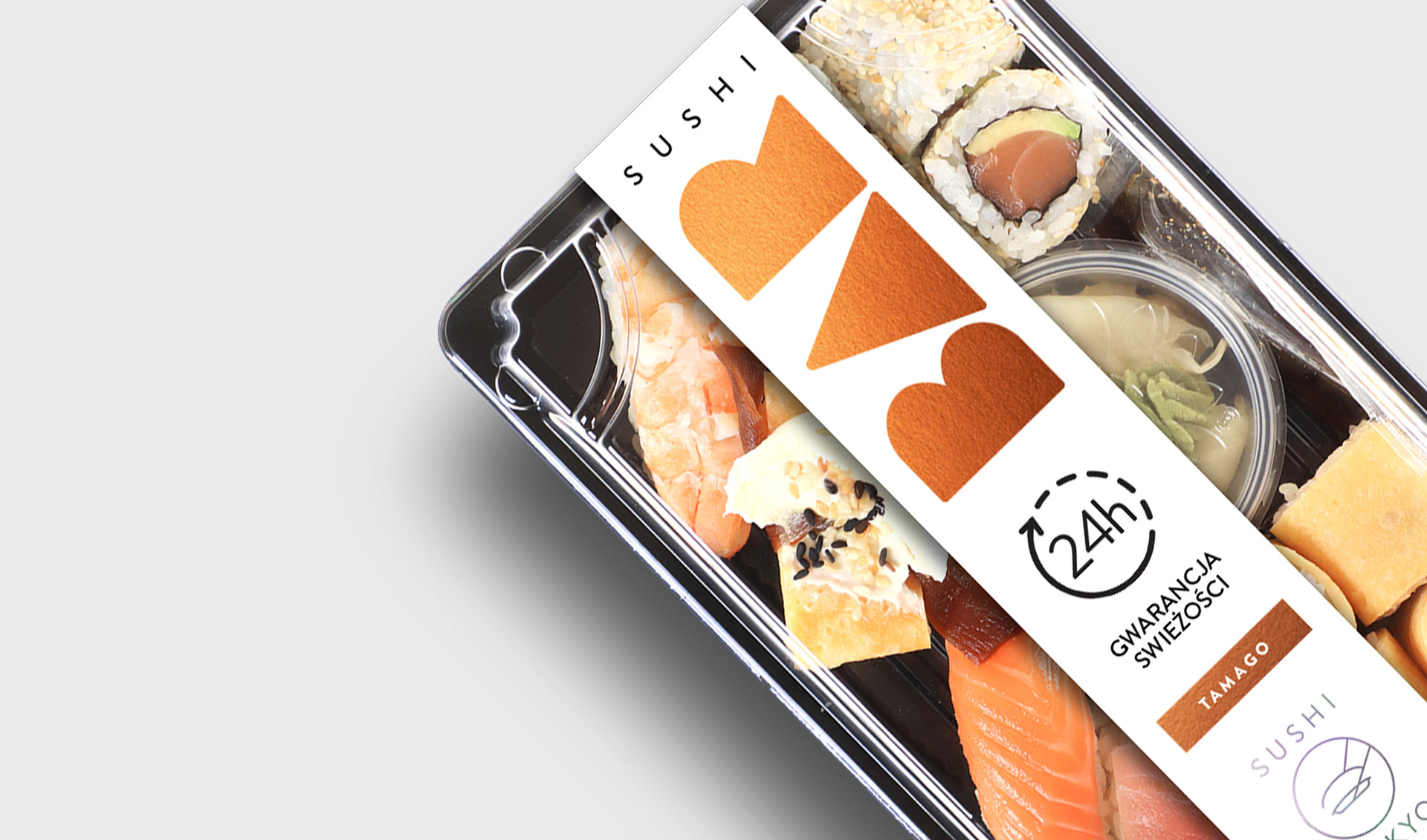
To create a premium feel, the main graphic elements on the packaging were accented with foil stamping in corresponding colors.
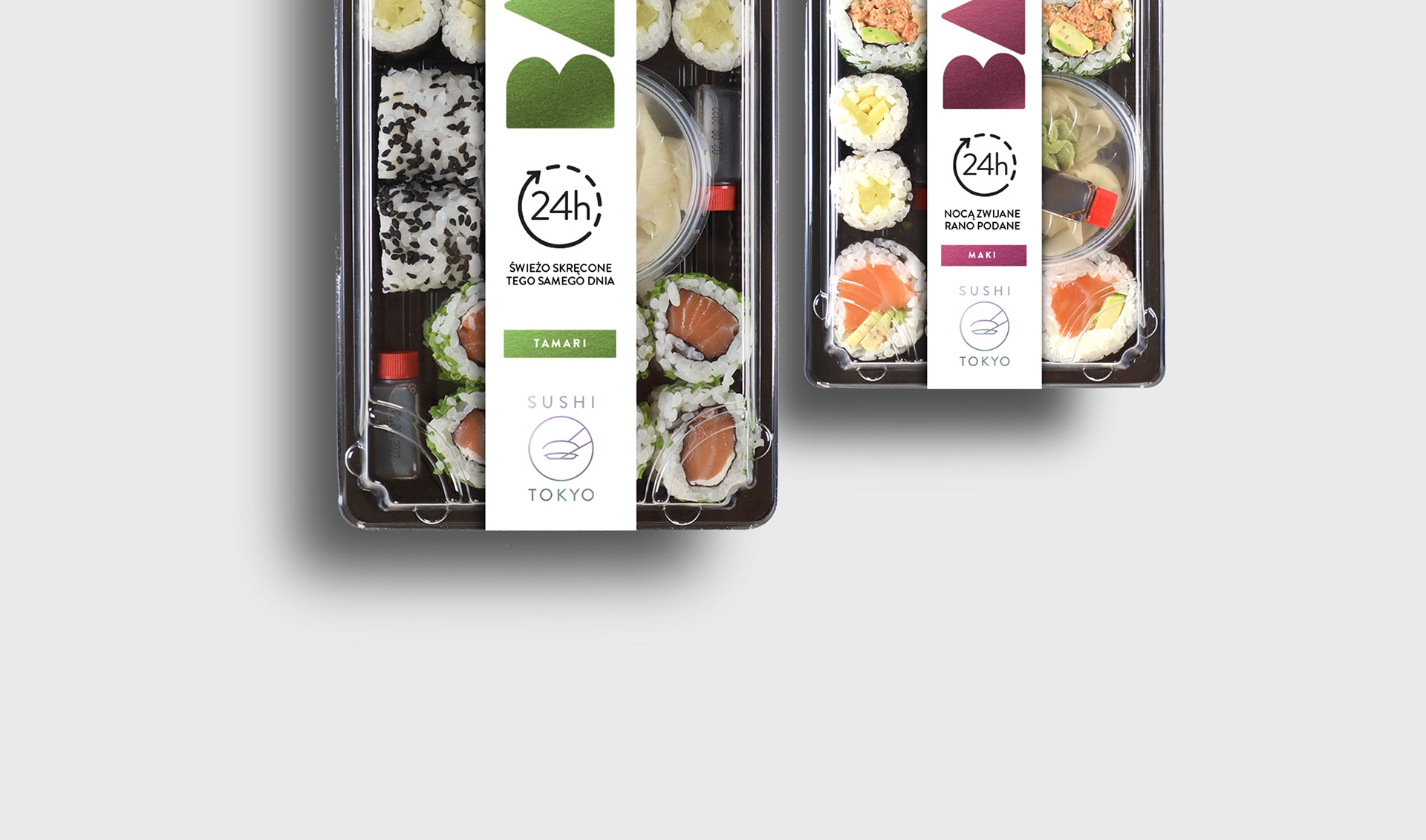
My client is already well-established and renowned in the sushi market in Eastern Europe, so we decided to leverage this reputation by prominently featuring the main brand’s logo to guarantee the highest quality of the product.